11 Email Design Best Practices That Drive Customer Engagement
11 Email Design Best Practices That Drive Customer Engagement
Are your customers not engaging with your emails as much as you wish they would? Do you have low click rates? There are several email design aspects that might be affecting your performance.
In this article, we will go through these aspects and the best email design practices to make your emails stand out and win your customers’ attention.
What is email design?
Email design is the process of creating engaging emails that resonate with your audience and attract attention. Email design involves much more than just making your email content look amazing. It’s about the whole concept – how you construct your subject lines, how much text you use, whether you add dynamic content aspects, etc.
Email design can also impact whether your emails reach users’ inboxes or end up in the junk folder. It’s one of the most important factors when it comes to your email marketing success.
Email Design Best Practices
1) Avoid text-heavy emails
People prefer conciseness when it comes to emails. When you send lengthy emails, users tend to skip parts or might decide not to read the content at all, and you will lose the chance of getting clicks or conversions.
Go straight to the point, don’t use long paragraphs. Your subscribers want to get the information you’re sharing in the simplest way possible.
You can split your content into sections and use images to make the emails more entertaining for users.
Using microsites is a great option for those who would like to send more information on specific sections but don’t want to make the overall email text-heavy. A microsite is a fully functioning web version of an email. The advantage is that user engagement within the microsite can be tracked and provide you with valuable information. Circulator provides its client with this feature. Read more here.
2) Use relevant CTA buttons
CTA (Call-to-action) buttons are essential for your email success. Navigate your users directly to where you want them to be. Each email needs to have a goal and only one related call to action button.
If you’re A B2C retail business, your call CTA button should be most likely “Shop now” or “See our products”.
If you’re an insurance company, there is a variety of CTA buttons you can use based on the email purpose. It can be: “Renew your policy” or “Call us now”, etc. You get the point.
Keep in mind optimising your landing page to be relevant to your CTA button and giving them the option to complete the action immediately. It can be frustrating for users landing on your page to take additional steps in order to complete a purchase or another action.
3) Keep your email design clean and simple
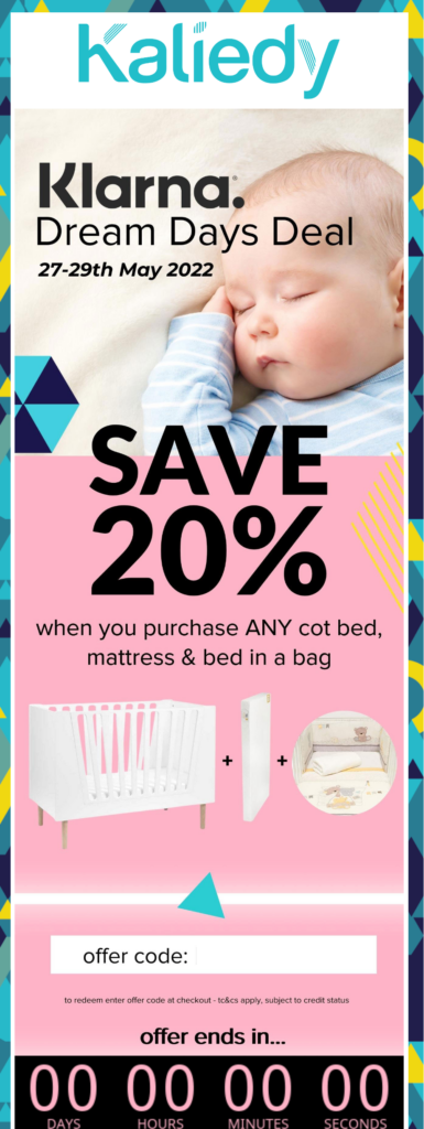
You can design beautiful emails while keeping them simple. It’s not an art contest. Using too many elements or colours can be confusing for your users, and they might have a hard time getting to the point.
Here’s an example of nicely designed emails by our client Kaliedy:
Circulator provides its customers with an easy-to-use drag-and-drop email editor, where you can create beautiful emails with minimal effort. Our team will create custom content blocks for you so you can save time when creating your emails.
4) Create powerful subject lines
Your subject line is the first factor of your email that your subscribers see and decides whether they open your emails or not. Therefore, you should pay extra attention to it.
The subject line needs to scream: “Open me!”
There are certain elements you can use in your subject lines to increase the chances of your emails getting opened and read. Here are some tips:
Use personalisation
Simply adding your subscriber’s name in the subject line makes the email look more personalised, and that alone can increase your open rate by 18%. At the same time, using personalisation can help prevent your email from landing in the spam folder or promotional tab.
Make your subscribers curious
You should give your subscribers a reason to open your email. You can start your subject line with a question that will be answered in the email. If you address a topic that people are currently interested in and ask the question well, the chances of your emails being opened will skyrocket.
Here are some examples of how you can use questions in your emails:
- Is now a good time to…?
- Should you buy…?
- What happens if…?
- Is … better than …?
Use numbers
Numbers generally attract more attention than words. Subject lines with numbers can achieve a 57% higher open rate compared to those without numbers.
For example, the title or subject line: “11 Best Email Design Practices” can give you a better idea of the content length and quality than just “Best Email Design Practices”.
Use emojis where appropriate
Emojis make your email more friendly and less formal, which may work very well for some types of emails. It depends on the industry and nature of the email you’re sending. You don’t want to be using emojis when you are conveying a serious message.
However, for special offers, discounts or other promotional announcements, using emojis in subject lines can help generate better results.
5) Use pre-header text
Pre-header text is additional text to a subject line that gives users more context of what your email is about. Typically, you can see the first words of your email next to the subject line, which sometimes doesn’t have to be enticing enough for users to open.
With Circulator, you can easily customise your pre-header text and preview it to know exactly what your email will look like before you send it.
6) Personalise your emails
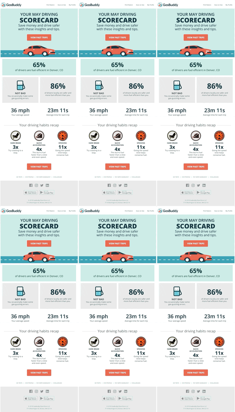
Personalisation has become one of the most effective email practices and is crucial not only in your subject lines but also in your email body, images, product feeds, etc. Personalisation helps you adjust your content to users’ behaviour, preferences or clicks.
With Circulator, our link labelling feature allows you to track users’ behaviour and build data repositories based on where they click in your email. It allows you to create hyper-relevant offers that your subscribers crave and can help significantly improve your click and conversion rates.
For example, the users that clicked on a specific product category or brand are going to receive a more relevant offer next time with the products they clicked on previously.
The ultimate goal is to provide the best user experience and be as relevant as possible. Therefore, there are no limits when it comes to personalising your emails. You can personalise subject lines, images, product feed, anything that can appeal to your customers.
Here’s a great example of using personalisation by GasBuddy:
Source: Really Good Emails
7) Brand your emails
Your subscribers should always know that it is really your company who’s sending the emails. Help them identify your brand even before clicking on your email by using your brand name and logo. Consider implementing BIMI (Brand Indicators for Message Identification) to display your logo alongside your emails and help prevent fraud. Learn more about BIMI in our dedicated article.
Your email should be your signature. You should be creative with your email content but remain consistent with your email design and branding.
With Circulator, you can simply give us your brand guidelines, and we will ensure your campaigns are always consistent, including your company colour palette, fonts and imagery. Thus, you can save time when creating your email campaigns and always be in line with your brand guidelines.
8) Go easy on images
Yes, having images helps break down the text and makes your emails look more appealing to your audience, but don’t overdo it. Having too many images or large images can make your emails load slower, and sometimes, they might not display properly. This can happen with a slow wi-fi connection or when you’re using data on your mobile phone.
Therefore, make sure you’re using the proper image size. The size shouldn’t be too large, but still enough so that the image is not distorted and all the elements display correctly.
The recommended dimensions are 600px to 650px, which should give you both, good loading speed and high quality. We recommend running an email test before sending to ensure that the images have the desired quality.
9) Responsive design
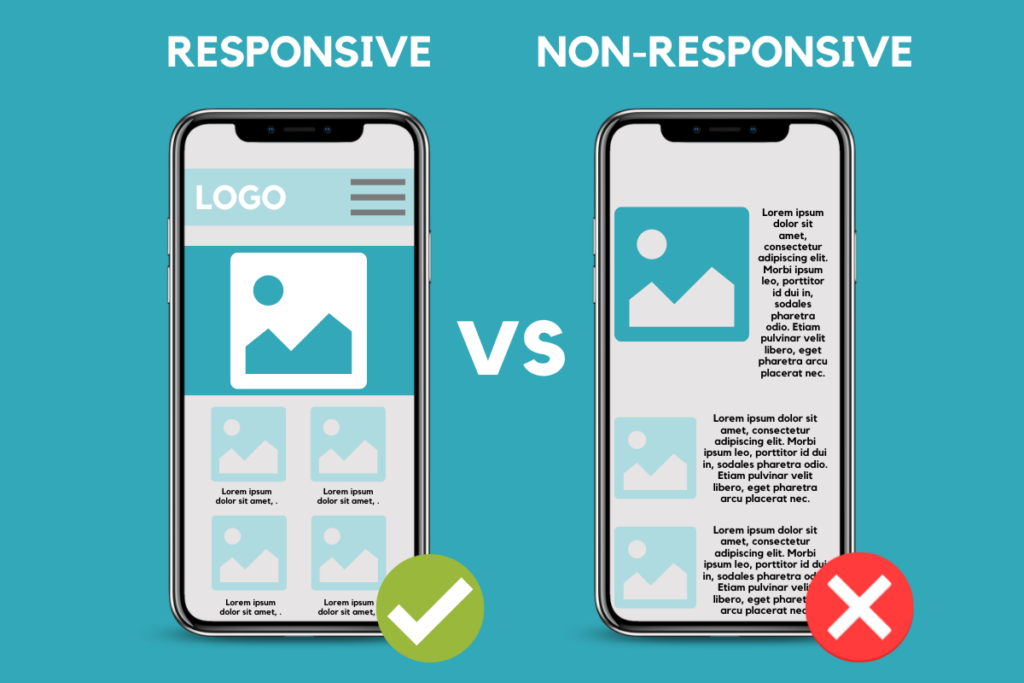
Responsive design ensures that your email displays correctly on any device (desktop, mobile, tablet) by adjusting its size to the screen, so your recipients will always be able to view your emails.
If you don’t use responsive design, it might happen that your emails will be all over the place and might not make sense to the readers.
On the other hand, incorporating it enhances user experience and increases your chances for a successful conversion.
10) Leverage dynamic content
Dynamic content helps you create highly personalised and targeted communication by automatically adjusting your content to match your customer’s preferences and expectations. It will improve the overall effectiveness of your campaigns and customer experience simultaneously.
Circulator provides its customers with the dynamic content feature and helps them create powerful email content. Learn more about Circulator’s dynamic content and email campaigns.
11) Create interactive emails
Emails have evolved in recent years, and interactive emails are a perfect example. With marketing getting more competitive, creating highly engaging emails is key.
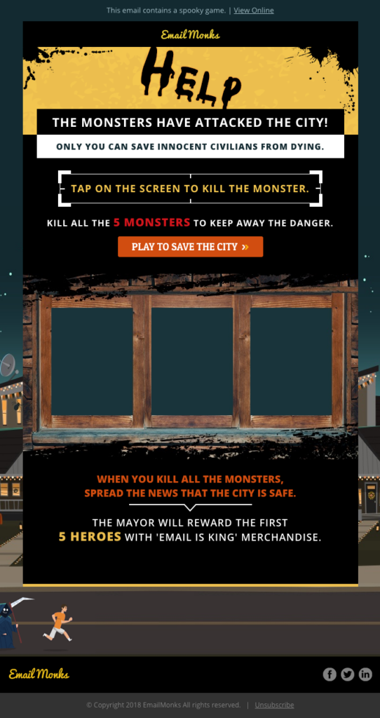
The interactive element means that users can take action within the email without having to leave to different websites or pages. This kind of email gives users multiple options before reaching the final destination, which creates a more personalised and relevant user experience and increases the chances for a successful conversion. These emails can include games, surveys or questionnaires.
Here’s a great example of an interactive email by Email Uplers:
Source: Really Good Emails
We also created an article about the best practices in email marketing if you want to get a more rounded knowledge of what could work well for your emails.
Visit our email design page to explore Circulator’s complete solutions.
Please don’t hesitate to contact our team of experts to help you with your email marketing efforts.
